Documentary culture has never been just about recording reality. It has always been about choosing a frame, editing a sequence, and deciding which lives are made visible to an audience hungry for meaning. That is why the visual traditions of documentary photography and worker photography matter so much today: they prefigure the way modern docuseries, true-crime shows, and creator-led nonfiction use images to make viewers feel like witnesses rather than passive consumers. If you have ever wondered why a stripped-down interview can feel flat while a collage of protest signs, archival stills, and handheld footage feels alive, you are already thinking in the language of political imagery and visual storytelling.
What makes this especially relevant for podcast audiences is that the audio-first world has quietly learned the same lesson: listeners do not only want information, they want a scene, a mood, a point of view. The best creator-led documentary projects borrow from protest photography, image-text collage, and everyday-life documentation to create a sense of urgency and intimacy that talking heads alone rarely deliver. In a crowded streaming ecosystem where viewers are also comparing options against rising subscription pressure, the look and feel of nonfiction has become part of the value proposition.
For creators, streamers, and nonfiction fans, the takeaway is practical: visual language is not decoration. It is the storytelling engine that determines whether an audience leans in, shares, subscribes, or tunes out. And as platforms keep chasing attention with true crime style pacing, social-issue docs, and hybrid formats, the old worker-photography mix of protest, satire, and daily life feels less like history and more like a template for the future.
1. Why worker photography looks uncannily modern
It blended activism with ordinary life
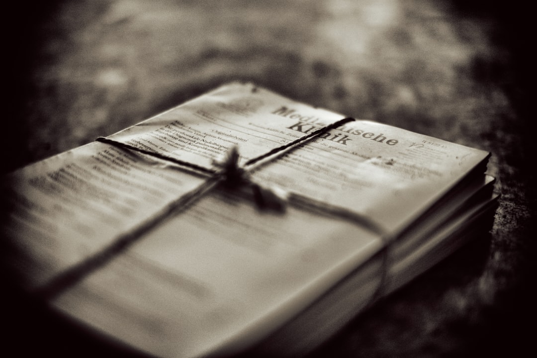
Worker photography emerged from political urgency, but its strongest images were never only about rallies and banners. Photographers documented factory floors, meals, smoke breaks, public transit, cramped housing, and family life alongside direct protest imagery. That blend gave the work emotional range: the audience saw not just a cause, but the lived conditions that produced the cause. In the MK&G collection discussed in the source material, the work of migrant photographers like Muhlis Kenter and others captured labor, exile, racism, sexism, and social inequality through an insider perspective, which made everyday scenes feel political without needing a speech bubble.
That same logic drives many modern docuseries aesthetics. A series about labor disputes, for example, rarely succeeds if it only shows podium speeches. Viewers need the visual evidence of work: hands, tools, schedules, uniforms, commutes, and exhausted faces. This is also why nonfiction projects often borrow from the observational style found in myth-busting media literacy pieces and from the evidence-forward instincts seen in evidence-based analysis frameworks.
Satire made the politics feel human
Many worker photographers understood that humor can be a form of resistance. Satirical images expose power by refusing to treat institutions as untouchable. That same sensibility appears in creator-led documentary, where a sharp visual gag, a wry cutaway, or an ironic juxtaposition can say more than a ten-minute interview segment. Satire, in image form, makes the audience complicit in reading the joke, which deepens engagement. In nonfiction video, that can mean overlaying official language over absurd imagery, or cutting from a polished executive statement to the messy real-world conditions it ignores.
This approach works because it respects the audience’s intelligence. It asks them to compare what is said to what is shown. For creators building a nonfiction series, that is a powerful principle: do not tell viewers what to think too early. Let the contrast between the image and the institution create the friction. If you need a production mindset for this, the lessons in the creator’s gear stack for fast-paced live analysis streams translate well into documentary workflow, especially when you want to capture commentary, reaction, and source material in one efficient pipeline.
Image-text collage anticipated the scroll era
One of the most modern qualities of worker photography is its affinity for image-text collage. Today’s docuseries and podcast companion pages are built on the same idea: a frame plus context, a still plus caption, an image plus evidence. Collage allows creators to juxtapose official documents, screenshots, headlines, and portraits in a way that mirrors how audiences actually consume information across tabs and timelines. This is especially effective for true-crime style storytelling, where timelines, maps, text messages, and archival stills create momentum without requiring constant narration.
From an editorial standpoint, collage also solves a trust problem. It lets audiences see the raw material. For teams thinking about process, the same discipline appears in proof-block page design, where evidence is arranged so readers can audit claims at a glance. In nonfiction, that visual transparency is gold. It turns the viewer from consumer into investigator.
2. The visual grammar that connects protest photography and true crime style
Framing the witness, not just the subject
Protest photography is often powerful because it positions the audience as a witness to something unfolding. Modern true crime style does something similar, but with a different emotional register: it invites us to observe, infer, and anticipate. Close-ups, handheld movement, dim lighting, and abrupt inserts all create the sense that we are seeing fragments of a larger system. This grammar is useful well beyond crime stories. It works in labor docs, environmental nonfiction, entertainment exposés, and creator-led investigations because it makes information feel urgent.
There is a reason so many contemporary series avoid over-reliance on polished studio interviews. Too much polish can flatten stakes. Documentary photography taught the field that imperfect images often carry more truth because they feel encountered rather than manufactured. If you are producing a nonfiction project, think about how each shot functions as evidence. This logic is as strategic as platform safety auditing or auditability in AI systems: form is part of accountability.
Archival texture signals credibility
Audiences tend to trust nonfiction more when they can see traces of time. Grain, scan lines, VHS artifacts, newspaper clippings, contact sheets, and low-resolution phone captures all carry the feeling of provenance. That is one reason archival texture is a staple of docuseries aesthetics and true-crime style storytelling. It suggests that the makers have done the work of collecting, verifying, and stitching together a record. Even when the image itself is imperfect, its imperfections can signal authenticity.
Creators should use this carefully. Texture should not become empty nostalgia. The goal is not to make everything look old; the goal is to make the sources legible. If you are organizing materials for a series, think like a journalist vetting a destination or service: check the origin, compare versions, and maintain documentation. That mindset echoes the rigor behind how journalists vet claims and the practical caution found in creator rights in AI training sets.
Juxtaposition creates meaning faster than exposition
Modern nonfiction often needs to earn attention in seconds, not minutes. Juxtaposition does that by collapsing argument into a visual comparison. A smiling corporate headshot followed by factory footage, or a pristine exterior followed by cluttered interior evidence, tells viewers that something does not line up. Worker photography mastered this technique long before streaming platforms did. Protest and everyday life side by side create a political charge that pure exposition cannot match.
This is why image-text collage works so well in trailers, promo assets, and podcast companion posts. It gives the audience multiple entry points: emotional, informational, and interpretive. For creators thinking about growth, the principle is similar to optimizing a promo calendar with live storytelling formats: you are not just distributing content, you are sequencing curiosity.
3. Why audiences are tired of talking heads
Talking heads are informative, but not always immersive
Interviews are still essential in documentary and nonfiction video, but they become less effective when they are treated as the entire form. Today’s audiences are sophisticated enough to recognize when a project has been built from a stack of interviews with minimal visual evidence. They want texture, contradiction, movement, and context. When a series leans too hard on talking heads, it often feels more like a panel discussion than a documentary.
This matters to podcast audiences too. Many listeners now expect companion visuals, clips, and social excerpts that extend the experience beyond audio. The most effective nonfiction creators understand that an interview only becomes cinematic when the surrounding material expands its meaning. That may include streetscapes, screenshots, documents, objects, or observational footage. In other words, interviews should be one layer in a larger argument, not the whole cake.
Nonfiction needs scene-setting to hold attention
Scene-setting gives audiences a place to stand inside the story. If you begin with a person in a chair explaining the whole premise, the viewer receives information, but not necessarily sensation. If you begin with a workplace, a neighborhood, a classroom, or a protest line, the audience gets geography, stakes, and mood at once. Worker photography did exactly this: it made social systems visible through environments and everyday routines.
That is also why creator-led documentary performs well when it uses the language of lived experience. A creator who films the bus ride, the waiting room, the loading dock, the recording booth, or the post-shift exhaustion is creating a relational map, not just a summary. If you want a practical production mindset, think of it like converting raw audience attention into a coherent sequence, the way marketers turn top content into structured proof in content sections that convert.
Trust is built through visible labor
Audiences trust nonfiction when they can see the labor behind it. That labor can be editorial, archival, investigative, or emotional. When viewers see the process of gathering, annotating, and comparing evidence, the work itself becomes part of the story. This is one reason behind-the-scenes inserts and source breakdowns are so compelling in contemporary docs. They create a shared sense that the filmmaker is not hiding the mechanism.
For streamers and creators, this is a strategic advantage. If your project is competing in an environment shaped by streaming price moves and licensing churn, trust becomes one of the few durable differentiators. A transparent visual method can be a brand asset, especially when the audience is skeptical of sensationalism.
4. Practical lessons for creators making nonfiction now
Build each episode around a visual thesis
Every strong nonfiction episode should have a visual thesis, not just a topic. Ask: what should viewers be able to see by the end that they could not see at the beginning? For a labor story, it might be the hidden choreography of shift work. For a true crime project, it might be the gap between public narrative and private evidence. For a creator-led doc, it might be the systems that shape a creator’s labor, monetization, and identity. The thesis should be visible in the shot design, not only in the script.
To do this well, build a source matrix. Gather stills, documents, location footage, reaction shots, interface captures, and ambient images before you lock the edit. Then group them according to what they prove. This is not unlike how an editor or analyst would organize signals in breaking-news sourcing or how a team might structure research in deep product review lab metrics: evidence first, narrative second.
Use image-text collage to slow down fast claims
When a claim is complex, image-text collage helps audiences process it without losing momentum. Pair a map with a headline, a quote with a photograph, a timeline with a screenshot, or a ledger with a portrait. This is particularly effective in stories where institutions prefer abstraction. Collage restores specificity. It says, in effect, “Here is the claim, and here is the material trace that supports or complicates it.”
Creators often worry collage will feel too “graphic.” In practice, the opposite is true when it is used with restraint. The key is hierarchy: one dominant image, one supporting text block, one evidentiary detail. Think of it like the discipline behind measuring uncertain ROI or designing real-time alerts: more information is not better unless it is structured.
Let everyday life carry political meaning
Some of the most resonant nonfiction images are the least dramatic. A lunch break, a folded uniform, a shared apartment kitchen, a ride home after a shift, a phone call with family abroad—these can be more politically potent than a speech. That is one of the great lessons of documentary photography: ordinary life is not a break from history. It is where history is lived. For audiences, those images create emotional continuity and make systemic issues feel personal without becoming sentimental.
If you are building a creator-led documentary, look for the repeated actions that reveal a person’s world. Repetition is cinematic. It gives viewers a rhythm to latch onto, and it lets small changes register as dramatic shifts. In that sense, the best nonfiction often behaves like a carefully staged version of everyday life rather than a series of arguments.
5. How streamers and podcast teams can package this style for discovery
Design thumbnails and key art like evidence boards
Discovery starts before play. Thumbnail design and poster art should signal not just topic, but method. A compelling nonfiction thumbnail often combines a portrait, a document fragment, and a high-contrast visual cue such as a red mark, a torn edge, or a stark caption. That visual promise tells viewers the project will unpack evidence rather than simply repeat headlines. It also helps the title do less heavy lifting, which matters when you are competing in a crowded feed.
Think of this as packaging for trust. The audience should sense that the series has receipts. That approach aligns with the best practices used in citation-sensitive publishing and in misinformation-resistant storytelling, where visual signals and source clarity go hand in hand.
Use trailers to show range, not just stakes
A great nonfiction trailer should show the full tonal spectrum of the project. If your documentary only previews the most dramatic soundbites, viewers may expect sensationalism and feel misled when the series spends time on process, context, or routine. If it only previews the slow observational material, you risk looking inert. Worker photography offers a useful model here: the range between protest, satire, and daily life creates a richer promise than a single emotional register.
For podcast-adjacent nonfiction, cut short-form clips that mix voiceover, B-roll, on-screen text, and object shots. This is especially useful when you want audio-first audiences to understand that the show has a visual dimension worth exploring. The effect is similar to the smart repackaging discussed in live storytelling calendars and content repurposing strategies.
Think in bundles, not single episodes
Streaming discovery rewards ecosystems. A series, after all, is easier to market when it comes with companion clips, source posts, explainers, and short visual essays. That bundle should be designed from the beginning. Consider one “evidence board” post, one “what we learned” clip, one archival image carousel, and one creator commentary track. Together, they turn a project into a recognizable nonfiction brand.
This bundling mindset mirrors the logic of smart consumer offers and platform strategy. In a market shaped by subscription fatigue, audiences are selective. If you want them to commit, your nonfiction must feel substantive enough to justify the time. That is where the crossover between art and strategy becomes obvious, much like understanding streamer pricing and licensing shifts or evaluating offers with deal-stacking logic.
6. A comparison of nonfiction visual approaches
The table below shows why documentary photography, protest imagery, and collage-based storytelling often outperform plain talking-head formats when the goal is to create immersion, credibility, and shareability.
| Approach | Visual Strength | Audience Effect | Best Use Case | Main Risk |
|---|---|---|---|---|
| Talking-head interviews | Clear, direct, explanatory | Trustworthy but sometimes static | Expert commentary, legal context | Can feel flat without B-roll |
| Observational documentary footage | Immersive, scene-rich | Creates presence and empathy | Labor, community, process stories | Can drift without a strong thesis |
| Protest photography | Immediate, charged, symbolic | Signals urgency and stakes | Activism, public conflict, crisis coverage | May oversimplify if isolated |
| Image-text collage | Evidence-heavy, layered | Encourages active reading | Investigations, true crime, archival nonfiction | Can become visually cluttered |
| Creator-led documentary | Personal, nimble, intimate | Feels authentic and contemporary | Behind-the-scenes, identity, process stories | Can over-center personality over evidence |
7. A practical workflow for creators making this style of nonfiction
Step 1: Gather images like a researcher, not a scavenger
Start with source discipline. If you are using archival photographs, newspaper scans, screenshots, or stills from protest coverage, document where each item came from and why it matters. Treat every image as both an aesthetic object and a piece of evidence. This protects your credibility and makes your edit faster because you know what each asset contributes.
That diligence is not optional in a world where audience trust is fragile. The same caution applies in rights and licensing decisions and in transparency around partnerships. Good documentary practice means you can show your work.
Step 2: Map the emotional arc visually
Do not only outline the story beats; outline the visual beats. Where does the project begin in surveillance, confusion, or distance? Where does it move into proximity, contradiction, or revelation? When does it give the audience a breath? The best nonfiction has a rhythm that alternates pressure and release. That rhythm can come from cutting between stillness and motion, public and private spaces, or archival and present-day imagery.
If you want a useful mental model, think of each episode as a sequence of evidence blocks. Each block should do one job: establish a person, reveal a system, complicate an assumption, or confirm a detail. This is not unlike the structure behind turning source material into learning modules, where pacing is part of comprehension.
Step 3: Design for extraction and sharing
Nonfiction now travels in fragments as much as in full episodes. That means your images need to work in social clips, article embeds, podcast promos, and thumbnail crops. Build with that in mind. A strong image-text collage should survive being seen for two seconds on a phone and still make sense. A strong protest image should tell a story even without narration. A strong creator-led documentary frame should communicate point of view immediately.
If you are planning a release strategy, use the logic of strong rollout calendars: lead with the most legible assets, then expand into deeper cuts. That way you satisfy both casual viewers and people who want to go down the rabbit hole. The same audience dynamics drive entertainment deal hunting and the rise of documentary companion ecosystems.
8. Why this matters now for streaming culture
Viewers want proof, not just packaging
In a saturated streaming market, polished packaging alone is no longer enough. Audiences are sophisticated, skeptical, and increasingly allergic to empty hype. They want nonfiction that feels earned, sources that feel visible, and visual language that signals thoughtfulness. The bridge between worker photography and modern docuseries aesthetics is that both trust the audience to read images critically.
This is why creators who borrow from documentary photography and political imagery often outperform those who rely on generic “premium” styling. The audience can sense when a project has a visual thesis. They can also sense when it doesn’t. In a climate shaped by bundle pressure and platform churn, that sense of specificity helps a show stand out.
Nonfiction is becoming a cross-medium ecosystem
The future of nonfiction is not just a TV series or a podcast. It is a connected set of assets: articles, clips, carousels, live discussions, newsletter explainers, and short-form social proof. That is why visual storytelling borrowed from activism and documentary photography feels so durable. It scales across mediums. A powerful frame can anchor a podcast episode, a documentary trailer, a homepage banner, and a social share all at once.
If you are building for this ecosystem, think like a producer and an archivist at the same time. Preserve the source trail, design the visuals for reuse, and be intentional about what each image says. The most effective nonfiction today does not just tell stories about power. It teaches audiences how to see power.
FAQ
What is the connection between documentary photography and docuseries aesthetics?
Documentary photography established many of the visual habits modern docuseries use now: observational framing, archival evidence, everyday detail, and a sense that images can function as proof. Docuseries aesthetics often translate those still-image principles into motion, sound, and editing. The result is nonfiction that feels investigative rather than merely conversational.
Why does protest photography influence true crime style?
Both forms rely on urgency, evidence, and visual contradiction. Protest photography captures conflict in public space, while true crime style uses visual fragments, documents, and atmosphere to make audiences feel they are piecing together a case. The common thread is that the image asks the viewer to infer meaning rather than passively receive it.
How can creator-led documentary avoid looking like “just talking heads”?
Build each episode around a visual thesis and use B-roll, archival material, interface captures, and everyday-life footage to support the interviews. Show process, not just opinion. If viewers can see where the story lives physically, the project will feel more cinematic and more trustworthy.
What is image-text collage, and why does it work so well in nonfiction?
Image-text collage combines photos, documents, captions, screenshots, or headlines to create layered meaning. It works because it mirrors how audiences actually consume information now: in fragments, across screens, with context arriving in pieces. In nonfiction, collage also improves transparency because viewers can see the evidence rather than only hear a summary.
How should podcast audiences think about visual storytelling?
Even when a show is audio-first, listeners increasingly expect a visual ecosystem around it: clips, cover art, source posts, and companion explainers. Strong visual storytelling helps a podcast feel more immersive and easier to share. It also gives the audience confidence that the story has been reported, not just performed.
What is the biggest mistake creators make with archival visuals?
The most common mistake is using archival material for texture without clarifying what it proves. Archival visuals should not be decorative wallpaper. They should advance the argument, establish provenance, or deepen the emotional arc. Otherwise they become aesthetic noise rather than documentary evidence.
Related Reading
- Your Videos in AI Training Sets: Practical Steps Creators Must Take After the Apple–YouTube Lawsuit - A must-read on creator rights, consent, and visual media reuse.
- Voice cloning, consent, and privacy: responsible use of AI presenters for creators - Explore the ethics of synthetic presentation in modern nonfiction.
- Working with Patient Advocacy Groups: Conflicts of Interest and What Creators Should Demand in Transparency - A useful transparency guide for any documentary partnership.
- Viral Doesn’t Mean True: 7 Viral Tactics That Turn Content Into Misinformation - Learn how to keep visually compelling nonfiction honest.
- Technical and Legal Playbook for Enforcing Platform Safety: Geoblocking, Audit Trails and Evidence - Helpful for creators who need stronger evidence practices and platform control.